
I’ve had 20 minutes so I thought I’d do a quick post about a nice little dashboard I made in PowerBi.
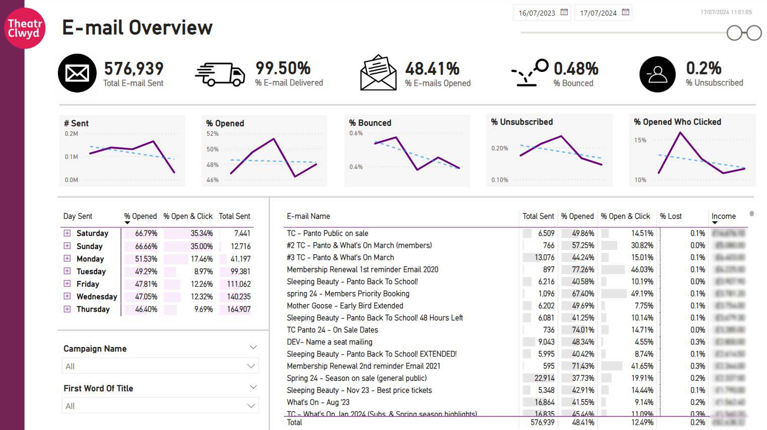
I’ve been really pleased with this one – not least because it does some quite clever things super quickly and I’m quite proud of it. I wanted something that was a) automated so I didn’t have to pull reports, b) was quick and responsive and easy to key actionable information from and c) was something I could share with my team… Anyway, this is what it looks like – it took around 3 hours to make (obviously with the caveat that the income line in the data table I’d made last year as part of a google analytics integration.
So yeah.
I’ve popped some note below, but hopefully it’s interesting!
Oh, and just a reminder, if you want to work with me at Theatr Clwyd then we’re looking for a Head Of Marketing (link here) and I’m always happy to have a chat in advance if you’re unsure or have questions.
AND…
Yes I am writing a new show – it’s slow going at the moment, but fundamentally it’s a) good, b) funny and c) predominantly about jet-washing and dogs. So if you want some of my “astonishing” storytelling (not my words) then get in touch…
P.S. If this is interesting leave me a comment or send me a message. ALSO join my mailing list here so that you too can get an e-mail from me every 17 months. Best, Sam
- Integration
Dotdigital has a slightly hidden feature to send analytics data to google sheets. Google sheets can take up to around 10m cells of data, and our data set (approx 17k unique e-mails) is around 1m. You can set it so that it reimports the data to sheets on a daily basis rather than create a list and append data (which would leave some data out of date each time). - Automation
Google sheets is the data source from PowerBi, a complete refresh of the data takes around 7 seconds, but it’s pretty much up to date on a daily basis. You’re unlikely to need it more than that anyway. To pull the data manually each day from DotDigital is probably 20 mins when you know what you’re doing so this is a nice time saver. - Slider
The slider in the top left means you can quickly change between dates – it doesn’t have a prev. period comparison, but you can do that manually. - Day Sent
On the left – this panel tells you which day is the best to send for you, but also the weight of data surrounding that decision. The plus logo to the left of the date gives a dropdown that shows… - Time Sent
Again to help refine the best send times for e-mails – it also shows number of e-mails sent broken down by time in the same way to day sent. - Sortable Table
A nice simple table with some conditional formatting to add the bar charts, sortable if you click the top too. - Campaign Name & First Word Of Title
So… The thing that DotDigital doesn’t export is any tags (yep annoying). So you can compare specific e-mails – e.g. if you typed What’s On we’d get all our monthly What’s On e-mails, and then you could (potentially) select them manually. Still, pain in the arse. However, I also created a new column with First Word in there which does a fake bit of grouping so that it’s easier to remove your “pre” and “post” show e-mails. - Income
This is a lovely bit where I take google analytics data, match up the campaign IDs which feature in both data sets, then pull the income data. Obviously it’s only looking at income from where the last click was the e-mail (so people who click, leave it a day and then go back via google will still get attributed to google). It’s lots of clues as to what’s going on!