Preamble
I wrote a post a week or so ago which, if I’m really honest, I expected to have the same impact as my usual posts – i.e. my mum would ring me to tell me I’d made a punctuation error, four people would read it (none of whom work in arts marketing) and I’d look at my google analytics seeing the number of page views crawl up from 1 to 2 to 3 to 4 and then finally, wheezing, end at 5 – yep, a staggering demonstration of ambivalence.
Anyway, the last post – click here to read – seemed to chime and be useful to people (which is pretty damning of everything else I’ve written…). So I thought, as for the first time in ages I have both time and something to say (not that it’s stopped me in the past), I’d keep posting.
As always please tweet me (@mrfreeman1984) or add me on LinkedIn if you read this and it’s useful/interesting – feel free to retweet it and share it – and the information contained here are my thoughts and not the thoughts of the organisation for whom I work (Theatr Clwyd).
Also as I said in the last blog – if you want a Zoom chat or just want to ask someone about an arts marketing thing then just ask or comment below (I mightn’t have an answer or be any help but I’m staying in a lot for the foreseeable future). I’ve broken this one into sections again, no particular order, just an assembly of thoughts, some of which I’m actioning as we ‘speak’ (also I’ve included images so it’s a bit less wordy…).

Introduction
I had a little cry the other day – it’d been a long day and, frankly, I felt like I was letting everyone down. I’d done some pretty flexible plans for how we might deal with losing the summer season, and had got through the initial “oh fuck” moment, but then, in the wake of that I’d felt lost.
The thing about structure is that it’s reassuring, we like to know the pace of things, the beats we have to hit, the moments that define the beginning, middle and end. Now that structure is gone, or at the very least is on particularly wobbly ground, it feels hard going. I’ve worked in Arts Marketing and in producing theatres since I was 20, this is what, by default rather than design, I know, it’s a comfort blanket that, for me, while occasionally interrupted by creative projects, is now severely disrupted.
Sometimes we all need a cry I think – for me it’s a reset point where my head identifies that it needs to be in problem solving mode rather than made do and mend mode. So with that in mind I’ve been looking to see what proactive steps I and the team I’m part of can take while the jelly beneath us solidifies over the coming weeks and months.
Website Refocus
I’ve been trying to work out what to do to get us from the reactionary state of “everything’s cancelled” to a more proactive state of “it’ll all be fine” while there’s still much uncertainty in the world.
I was really conscious looking through our website that while it tells the story of what’s happened – the Covid-19 announcement, the creative response, the reams about cancelled shows – it doesn’t suggest or imply what happens next. Sure we mightn’t know exactly, but its about changing the narrative ever so slightly – giving hope. It feels a bit like our website was the equivalent of an early-round Masterchef starter – lots of great ingredients on the plate but not entirely coherent and certainly not something you’d put in front of Jay Raynor when he’s craving a main course.
He’s some things we’re looking at doing (and some we’ve done) practically to move us on:
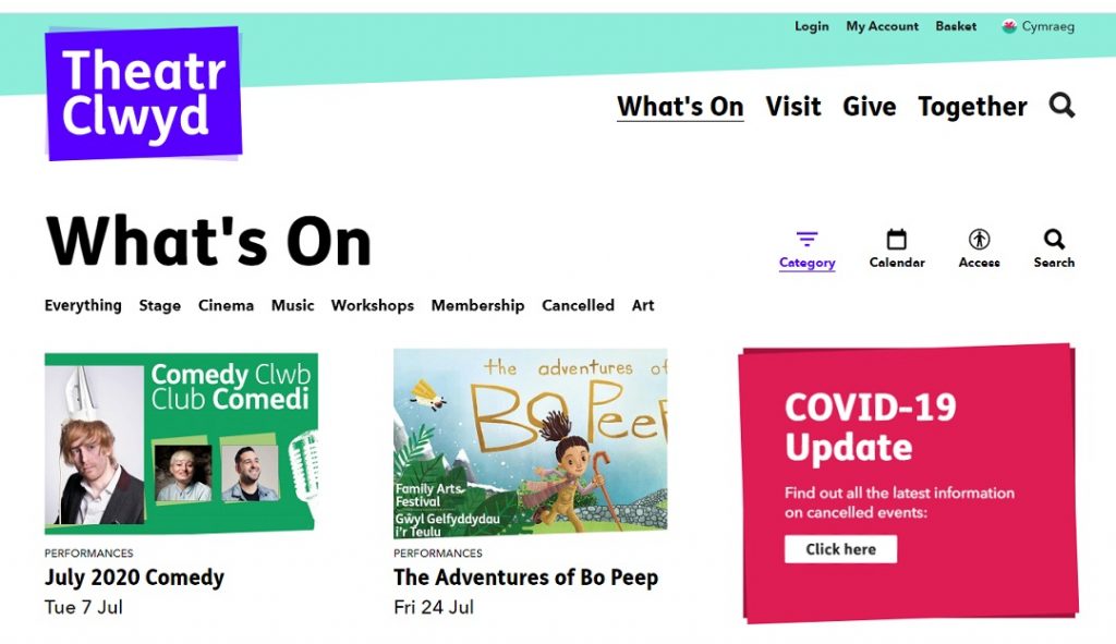
- What’s On – When you hit our chronological What’s On page you were confronted by reams of cancelled shows – we need to guide people to things they can buy rather than rely on them to circumnavigate the wall of cancellations that was increasingly acting as a barrier. We created a new category called ‘cancellations’ and stuck all cancelled events in there so that people can find them but also so that shows that are active (largely from October) can be seen. Of course we don’t know if the active shows will suffer the same fate (or indeed if social spacing will kick in rendering the show nonviable), but it presents a subtle face of optimism for the future.
- Positive News – We’ve got positive news stories (as many organisations do) – from being the host for blood donations to sending out food and creative parcels – they’re a bit hidden – again we need to tell people these stories, they’re positive and feel-good and probably great for anyone to not feel so desolate. They need to be weaved into the narrative of our marketing and communications so that we tell the story of the brand not just the consequences of a lockdown. Everyone hates writing news articles for the website – no-one ever seems to read them and it takes ages to do – on my list is to revitalise this and actually use them – tweet them, facebook them, linkedin them – show that we’re a vibrant organisation that’s more than shows.
- Donations – Our website designers Supercool (who are amazing – click here) have created a great donation widget for Spektrix Clients – we’re going to be integrating this more with our stories, news and shows – telling the story of the organisation as a charitable organisation as well as advocating for support so we have a strong future is going to be really important.
- And Also – ALSO, I’ve still not written a blog about how Supercool redesigned our website. They are the best people and they’ve done some great work, they got our website in early and painlessly (relatively!) – if you’re looking at web designers at any point I’d really recommend them.
- Membership – We have a membership scheme – with little to sell but lots of people who want to support us membership offers a more tangible thing to help the organisation – we’ve also been looking at how we integrate our membership with subscription offering members deeper early bird subscription discounts – we’ll need these people by our side, shoulder to shoulder. We’re looking at an acquisition campaign that will look at the most loyal top audience segments as well as reengaging with some of those we’ve lost of over the past months.
- Contact Us – The phones are off (well, not quite, they’ve a holding message temporarily), so we need to remember that people will still need to get in touch. I’ve noticed that lots of organisations (ourselves included) have a “contact us” page with a list of names and titles that feels soulless and a bit confrontational – it doesn’t set a positive tone for any forthcoming contact – instead I want people’s faces, I don’t care about job title, I want to know how they can help me – they should be beautifully designed – check out architects Haworth Tompkins contact us page which has (on desktop) a lovely rollover feature on the images – and they all look like people (the B&W thing is a clever aesthetic choice alongside their brand – particularly great contrast with the fun full-colour rollover images).
- Tone and writing – Tone is really tricky and is, of course, intrinsically linked with brand identity. But I’ve noticed that getting a consistent tone throughout isn’t always easy. For some things we write clever, joyous sentences that are light and flow off the mind’s tongue while for others we sound like we’re trying to bore people to death with words. Often it seems like we’re adding words as if the measure of success is the word count – I noticed how great Amazon (boo) product listings usually use bullet points, they use illustration, they’re benefit led – we can learn from that – maybe less is more, maybe 3 great sentences are better than 2 paragraphs – get to the point quickly, say it smartly and beautifully, keep the sentences sort and avoid jargon. I’ll also be the first to point out the hypocrisy of me writing that in a blog that could really do with taking its own advice… or should it? Maybe it’s my covert personal brand identity*..?
Analytics
Analytics are never high enough on my to do list. I tend to pay close attention to sales figures and trends, similarly with global sales data but very rarely get the time to consider what analytical tools are out there to help guide my hand as a marketeer.
Poking around into data can be fruitful. For example looking at the retention rate of video content can help guide you as to what content resonates with audiences and that, in turn, can influence where to invest budgets.
For us it’s this clip from our panto (below). How do we know it’s useful for us? It’s a really high retention rate, it’s been shared on multiple channels, it’s got a decent response rate, but when people view the clip on our website there’s a strong chance that it’ll take them then to look at looking at tickets for this year’s panto. Of course they’re not buying those tickets at this exact locked down moment – but we’re capturing their visit in a remarketing funnel on google adwords and facebook for a rainy day when ticket-buying is a thing again.
I’m a big advocate of knowing your data but it can be incredibly intimidating. Where to start?
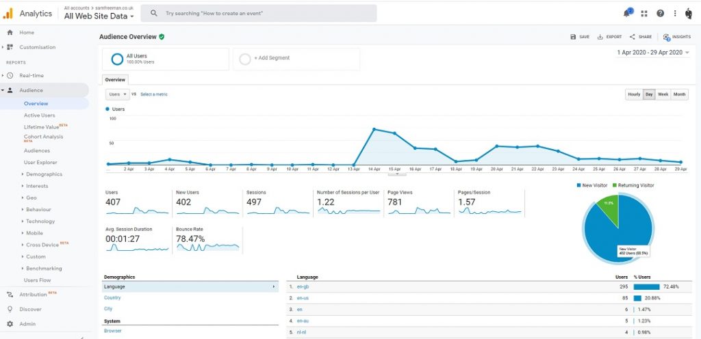
- Google Analytics – Get your head around user behaviour first – who is doing what on your site. If you see that on one page people are spending a longer time than others then ask yourself why – look at the page – role play it – is it really interesting information for the uninitiated or a confused convoluted mess?
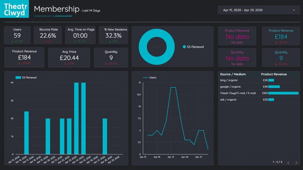
- Google Data Studio – An easy access point into making some nice digital reports – I’ve put a sample here (below) of the kind of thing you can make – it’s easy to link to Analytics and if you’ve got amazing web developers (like Supercool) who’ve got your e-commerce tracking nailed then you can learn loads about what your audience are or are not doing.
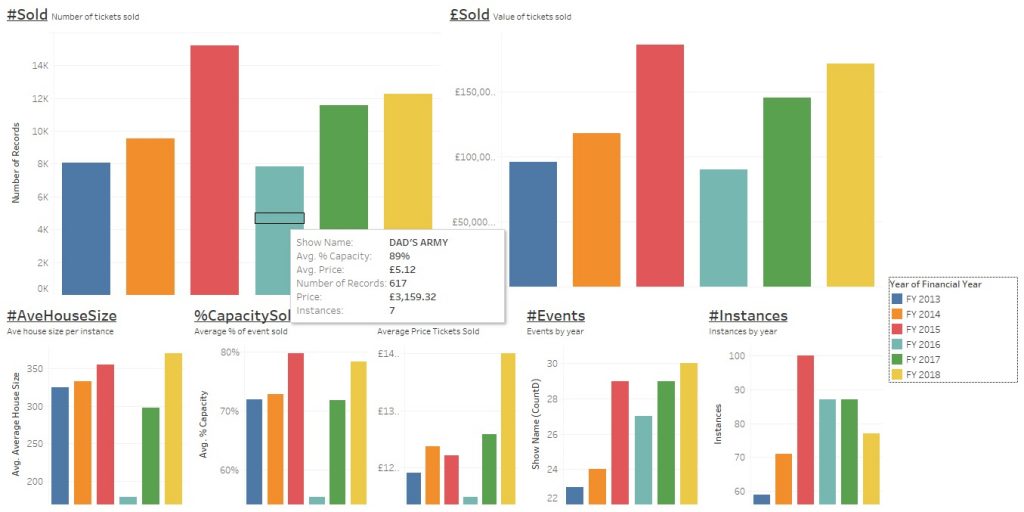
- Tableau – This is the big daddy of data visualisation programmes – it’s expensive although charities can get a hearty discount – it’s simple to get started with but can be tricky to master, particularly with old or not particularly tidy data. There’s a free demo and it’s worth a play – if you’re on Spektrix there’s some easy .csv downloadable custom reports you can make and analyse – while Spektrix’s reports are pretty speedy, using Tableau can make Spektrix seem positively sluggish and, more importantly, you can ask questions of data without having to make a cup of tea between requests.
Facebook Maintainance
I’ve been thinking a lot about how we restart our marketing activity when, finally, we have that moment where we feel confident that any marketing spend won’t be simply burning cash for no return. I’ve done a couple of things I think will be useful now but also for the future.
- The Code – The first thing I did was to check that our facebook pixel (or remarketing code) was correctly installed. I know from bittersweet experience a few years ago in a past role that you can have it installed and then you either a) failed to click ‘publish’ on google tag manager or b) you didn’t copy and paste properly. It’s easy to check, simply go into your business account click Events Manager and then the Data Sources tab – it should show a graph of activity but also when it last received data.
- Custom Audiences (pt.1) – In Audiences I created a number of custom audiences based around the cancelled events – adding anyone who visited the relevant pages in the past 30 days to a group. When the show’s back if rescheduled I’ll do a targeted facebook campaign about it’s return using this list as it contains people I know have already (probably) been interested.
- Custom Audience (pt.2) – In Audiences I made some custom audience lists for programmes of work – we’ve cancelled a load of our INCREDIBLE comedy club gigs (I’m biased as I book them, but we sell between 120 and 240 on a Tuesday night usually so I’m taking it) – we’ve made a custom audience that puts anyone who’s visited the show pages or responded to our facebook events – again an easy win.
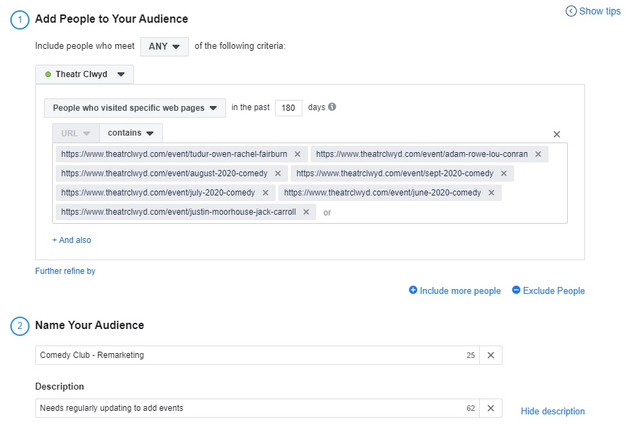
- Toe in the Water – I mentioned “toe in the water” campaigns in my last blog – I’ve just implemented these small, low-expenditure campaigns on facebook – results in about 10 days time:
- Panto (top segments) – Panto is a reliable big hitter for us but its also taken a massive decline in sales. I’ve targeted people who follow our page whose engagement with the organisation we can assume to be higher to see whether there’s a willingness to book – essentially can we get a positive ROI.
- Tom Rosenthal – I’ve also got a campaign running to target people who aren’t connected with the organisation but for whom name recognition is a likely motivator of sales – again I’m looking for a positive ROI, but also data to compare to pre-covid levels (we’d done campaigns on both these events pre-covid, although, if we hadn’t we’d be able to use aggregated data to try and work out a better picture of audience responses).
Subscriptions – Reducing Risk
There’s been much talk about how both what will make audiences feel comfortable returning to venues (with great work being done by Indigo on audience research and sentiment – click here to read) and the first venues breaking cover about how they will implement social spacing – Barrington Stage Company (click here) seem to be the first to go for it head on in putting down a marker of what they will be doing.
We were due to be releasing our next Classical music subscription next week – we decided to pause it until we feel more confident about audience reaction and, ideally (although we’re not counting on it) for some sort of leadership and guidance from central government.
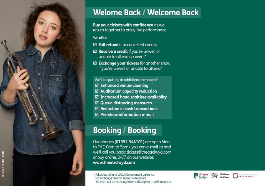
I’ve been thinking about how we make it more reassuring for audiences and also how we indicate the measures we’re going to take – the approach is not to hide it but also not to put it front and centre** – the page below is the (first draft) of the back page of our our classical subscription brochure – I’ve tried to put emphasis on both protecting people’s investment (it’s a subscription so is higher total value) in the season, while also reassuring about how we’ll be looking after them. I’ve not mentioned Covid or Coronavirus as it’s obvious they’re the cause – at the moment the language isn’t quite right (for our brand) nor does it necessarily quite invoke the warmth and confidence it needs to – but it’s a start on finding a tone (also the massive amount of green space is for the Welsh language, I’m not an incompetent designer).
Plans B, C and D + social spacing
I thought I’d do a quick rundown of the scenarios I’ve been running (I’m sure we’re all doing it, so this is purely for comparing and contrasting).
- 2 meter spacing between individual seats
Practically possible but impossible financially. - 2 meter spacing between households
Assuming that people come in groups of 1s and 2s – this is a potential box office nightmare, and liable to be incredibly high maintenance to make it work properly. It’s also impossible financially. - Two seat gap between each pair of seats
…and pairings angled so that no-ones got anyone sat in front or behind them directly. Easily implementable – still a sizeable financial hit, but not crushingly so – with the impending slow return of audiences this mightn’t be a bad solution. - Alternate rows empty
Easy to implement, doesn’t solve many social distancing issues – knocks the auditorium size in half. The two seat gap option is better and gives the same reduction in numbers. - Max Capacity 500 or 250 or 100
Easy to do, BUT probably not tremendously reassuring to audiences (particularly when you read the Indigo data – our theatre is just over 500 seats) or what audiences expect, we’d need clarity about whether the 500/250/100 includes stage and venue staff or not and whether 500/250/100 is a venue limit or an auditorium limit. 500 is doable, 250 isn’t impossible, 100 is potentially crippling.
Recommendations to Read/Do/Try
A few things I’ve found useful over the last few week (or interesting) that might make working at home, or digitally, or with your team a bit easier! And a few are good just for inspiring ideas…
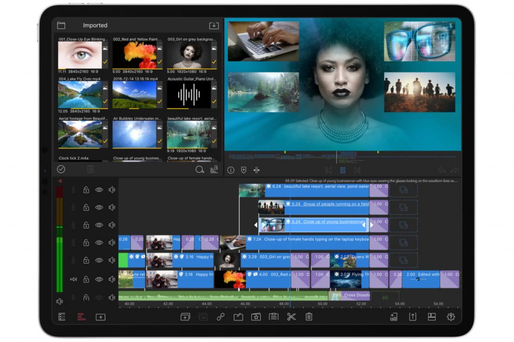
Luma Fusion – A great editing app for ipad. We’ve struggled in the past for editing clips quickly – Premiere Pro is very expensive and requires a high-spec PC and can take an eternity to export, while iMovie feels like it’s for kids and isn’t sophisticated enough to get a real glossy finish on video. Luma is fast, easy to use and exports 2 min clips in under 40 seconds at 1920 x 1080. Click here to find out more.
Filmic Pro – If the video/camera app on ipad is a little disappointing then this is the solution – it allows you to create higher quality video with a basic ipad as well as do things like white balance, pull focus and balance sound easily (although you need a rode adaptor for mics or a video mic for mobile!). On the website it’s worth checking out the contest finalists – some of them are incredible. Click here to find out more.
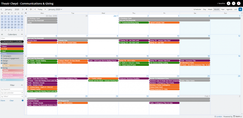
Team Up – We use this for all our planning – it’s a diary basically, but if you need to visually plan in things, and you need multiple people to work on it simultaneously, and be accessible remotely then it’s a godsend. I used excel for my planning for years. It was shit – we’d have 15 different versions and people would forget to save and it’d never sync. This is brilliant and there’s a great free version. Click here to find out more.
Pixlr – Free online alternative to photoshop. If you need to get images web-ready or do minor visual edits then I’d highly recommend it – it’s intuitive to use, quick and, crucially, free. Click here to find out more.
Google Data Studio – Is brilliant – I’m a recent convert but it’s a much easier way to get into data visualisation and build dashboards that work for you. Think of it as the gateway data programme before you get addicted to Tableau and start coming up with crazy graphs at 3am (it happens…or rather it happened to me). Click here to find out more.
OBS Studio – Live streaming programme that’s free, easy to use and a good access point when you’re live streaming to multiple platforms. If you’re doing a free and managed broadcast of something to multiple free open access channels and you’ve no cash then I’d recommend it. Click here to find out more.
Draw.io – Every year I used to draw the segmentation model like a flowchart by hand (it’s a good way to make sure you don’t miss people) – Draw.io allows you to make them properly, easily and in a clearer easy to use way – it’s also free. Click here to find out more.
It’s Always Right Now, Until It’s Later – This is one of my favourite shows by Daniel Kitson – it’s not marketing related but I think you’ll enjoy it. Also, if you do rent it then you can see me momentarily as I was at the recording.
Next Blog
Finally… I’m never quite sure what to write about… So I thought I’d ask you… If you want me to write about something specific then bob me a tweet? I’ve been pondering segmentation mapping and how to work them out… but it could be dull as dishwater***… We’ll see…
P.S. I am lucky to work with an incredible team who are #Legends and without whom I would frequently crumble. Thank you.
P.P.S As soon as this lockdown is over I’m likely to stop blogging again to do some creative stuff. If you happen to have a venue that seats around 100**** that might need a show in Nov/Dec or early Spring please let me know!
*No it’s not, I write too much.
**So in the middle then.
***It even sounds dull just suggesting it here.
****My solo shows have never sold more than 22 tickets – check them out on my Live page.

2 responses to “Arts Marketing – Building houses on jelly”
Hi Sam, I just wanted to say thanks for your recent blog posts re arts recovery post Covid.
I found your blog from a link on the Spektrix blog. I’m always looking for new ideas – It’s hard to find marketing info specific to performing arts.
Our network of small venue box office / marketing ‘professionals’ in NSW/Vic is quite removed from the larger events like Intix, so I’ll take whatever info you are willing to share – even segmentation mapping!
Cheers from semi-isolation in Australia
This made my day. Glad to have helped!